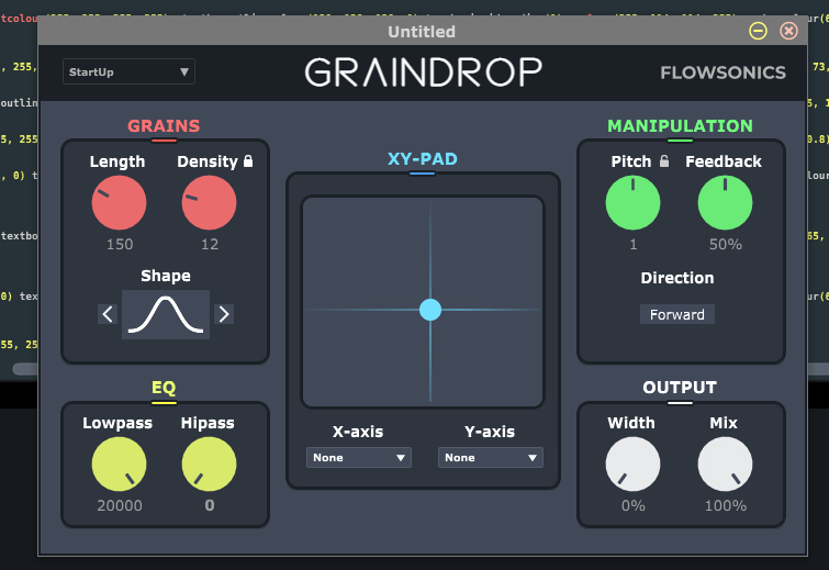
Hi, looking for some feedback on my UI.
Which one do you prefer best?
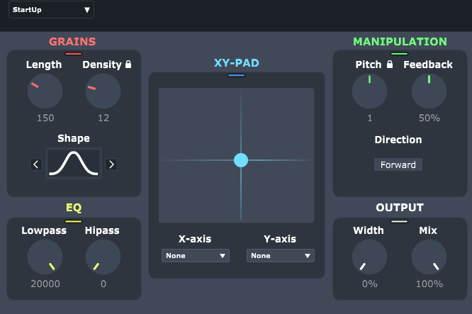

Hi, looking for some feedback on my UI.
Which one do you prefer best?
I think I prefer the look of the top one with the black outlines…
I agree +1
I have a hard time picking between 1 or 2… but IMHO definitely not 3.
Looks good tho, can’t wait to try it!
I prefer the first one. Nice design tho!
I don’t think the coloured knobs are too much but I would swap the xypad colour with the white. I think white might work better in the middle 
You mean the color of the ball or the background?
The title XY-Pad and the ball, I would make them white to match the GRAINDROP above them. And I would use the blue for the OUTPUT section. But again I must say, I’m no authority on this!
My opinion is for the second one here… but other than that agree with Rory’s suggestion about matching the text and xy pad colors. Looking great tho!
Thanks, I think I will go for the first one, but I like both. I think the first one will catch more eyes and makes the knobs more accentuated?
But not sure though…
Number 1 for me.
One thing I’d say is if it’s not vector make sure it’s large enough. I’ve been seeing a fair few Cabbage interfaces that are bordering on completely unusable on a hi Rez 14 “ laptop screen.
What do you think is a fair resolution? Also, is resizing with vectors possible in cabbage? (for the user in DAW)
My screen defaults @ 2160 x1440 and I’d say make any text no smaller than the text you see for files and folders on the desktop, any smaller you make it unreadable. If you look at the UI for Tonez - too small, although the text is just about legible. Decalog - way way too small, most of the text is illegible.
Thanks! Yes, very good points